|
 |
|
| Jim Worthey • Lighting & Color Research • jim@jimworthey.com • 301-977-3551 • 11 Rye Court, Gaithersburg, MD 20878-1901, USA |
|
|||||||
|
|
|||||||
|
| Legacy
Understanding |
|
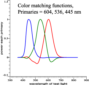
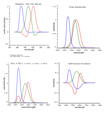
Fictitious but realistic color-matching data. |
 |
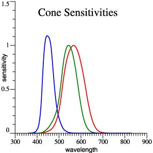 |
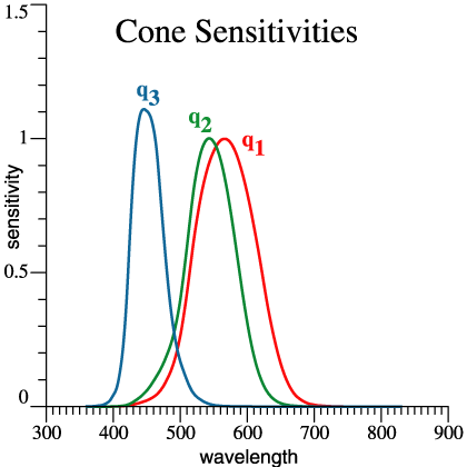
Cones,
red,
green and blue. |
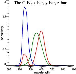
| Traditional
x-bar, y-bar, z-bar |
 |
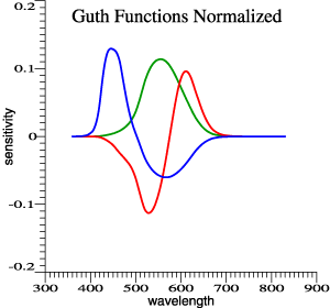 |
Guth's 1980 model,
normalized. Achromatic function is proportional to y-bar. |
|
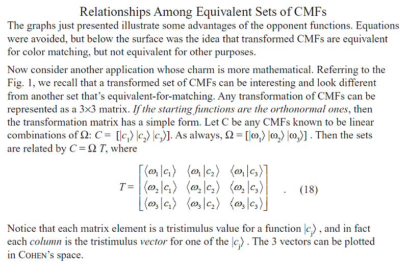
Linear transformations
of color-matching data predict the same matches.
|
|||
| How
does a set of 3 functions predict color matches? |
 |
 (Eq. 1) |
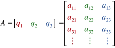
| A
set of color matching functions, CMFs, can be thought of as column
vectors, which become the columns of a matrix A. Matrix A can contain
any of the 4 sets of color matching functions above, for example. |
|
| SPD
as a Column Vector |
| The
spectral power distribution of any light can be written as a
column vector L1.
It is then summarized by a tristimulus vector V, V = AT L1 .
(2)
Light L1 is a color match for light L2 if AT L1 =
AT L2 .
(3)
Refer again to the 4 equivalent sets of CMFs shown at the beginning. If Eq. (3) holds for one set, then it will hold for others. That much is part of standard teaching. |
 |
| Moment
of Reflection |
 |
So, everybody knows
that alternate sets of functions can be equivalent for color-matching.
But it's remarkable that 2 sets can be equivalent-for-matching, but
also look very different, and be suited for other applications that go
beyond matching. For example:
Nominal time = 3:58 pm, Mountain
Time
|
| Animation
Digression: Simulated Experimental Data |
| What's Missing? |
|
So... we have at least 4
interesting sets of functions that are equivalent-for-matching, but
have further meanings. What's missing is a good scheme for vectorial addition of colors. In his 1970 Book, Tom Cornsweet emphasized vector addition to account for overlapping receptor sensitivities: |
 |
 We’ll
let the details go, because my method is fancier than Cornsweet’s. To
be consistent with Jozef Cohen’s discoveries, and enjoy other benefits,
we can make color vectors by starting with ...
|
| Orthonormal Opponent Color Matching
Functions. |
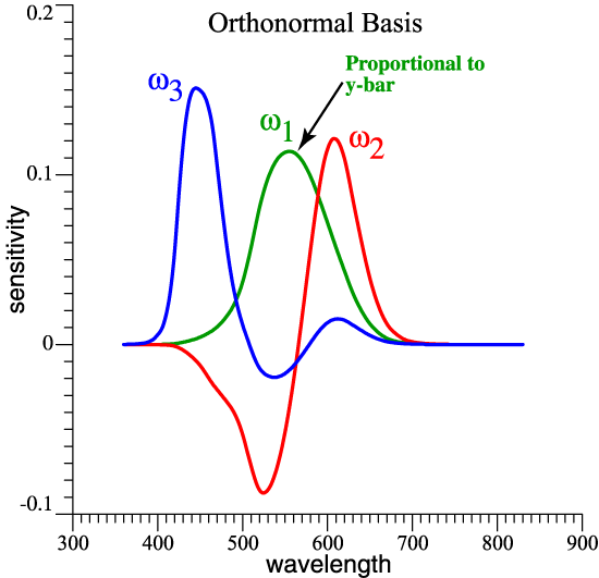
| Orthonormal Opponent Color Matching
Functions: Description. |
| Bra
and Ket Notation (not
in notes, sorry) |
| Working
Class Summary |
| Although many clever ideas (from
Cohen, Guth, Thornton, Buchsbaum, etc.) guided its development, in the
end the orthonormal basis is not radically new: |
|
 |
|
| Practicality |
|
A new orthonormal basis could be created for any standard observer or camera. If it will suffice to have orthonormal opponent functions based on the 1931 2° Observer, then tabulated data are available at http://www.jimworthey.com/orthobasis.txt . |
11etc, etc. Recall that graphs are above. Nominal time = 4:08 pm, Mountain
Time
|
| Alternate Practical
Presentation |
| If you already
have
the functions x-bar, y-bar, and z-bar handy in your computer, then you
can generate the orthonormal basis by adding and subtracting those
vectors. It's one matrix multiplication. If T is the 3×3 matrix below, and X is the array [x-bar y-bar z-bar] , then Ω
= X*T
.
What's below is program output, where OB = OrthoBasis = Ω . The output is self-explanatory if you know what the "unity operator" is. To learn about the unity operator, read Fun with Orthonormal Functions. |
| Call OB =
OrthoBasis, and X = [x y z]-bar Then X = Unity*X X = OB*OB'*X OB = X*inv(OB'*X) inv(OB'*X) = { [ 0.0000000000 , 0.1875633629 , 0.0306246445 ] [ 0.1138107224 , -0.1332892909 , -0.0312159276 ] [ 0.0000000000 , -0.0397124415 , 0.0793190892 ] } And why so many digits? If Ω comprises 3 orthonormal vectors, then ΩTΩ = I, where I is the 3×3 identity matrix. If OB has been generated by some calculation, it can be checked by a quick calculation: OB'*OB = { [ 1.0000000000 , 0.0000000000 , 0.0000000000 ] [ 0.0000000000 , 1.0000000000 , -0.0000000000 ] [ 0.0000000000 , -0.0000000000 , 1.0000000000 ] } . Carrying plenty of digits gives a convincing identity matrix in the check calculation. |
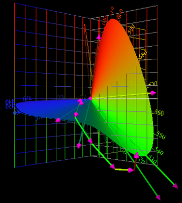
| Graphing
a Vector |
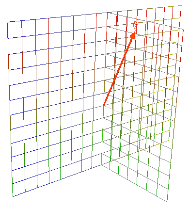 |
Now recall Eq. (2)
above, and let A = Ω
. That is, let the set of CMFs be the orthonormal set. Then V = ΩT
|L1〉.
A
tristimulus vector V can be
graphed in 3 dimensions. At left is the
vector for a 603 nm narrow-band light at unit power. The
vector length depends on the optical power of the light and
the eye’s sensitivity at that wavelength. By definition,The ket notation is a
reminder that |L1〉
is a column vector.
V = [v1 v2 v3]T.
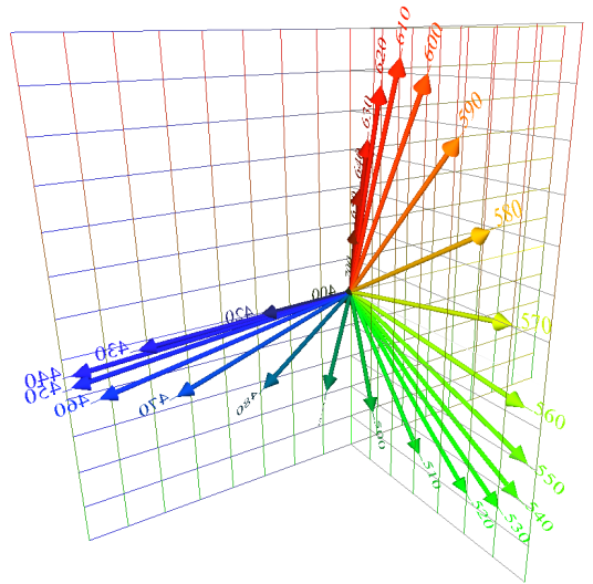
The vector is drawn from the origin. The achromatic (= white) v1 axis is the line from the origin that fades to white. Up-down is the red-green v2 axis with red at the top. To the left from the origin is the v3 or blue axis. The opposite of blue is yellow. The graph paper is colorized according to the color directions. The intuitive meaning of the opponent-color functions ω1, ω2, ω3, leads to an intuitive graph. |
| 5
Vectors |
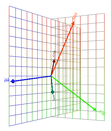 |
At
left 5 colors are graphed: Thornton’s Prime Colors, 603 nm, 538 nm, 446 nm, plotted at unit power, give long vectors. An extreme red, 650 nm, and a blue-green, 490 nm, also at unit power, give shorter vectors. What is the significance of vector length? The algebra of color vectors is specifically about additive color mixing. |
| 5
Vectors Added |
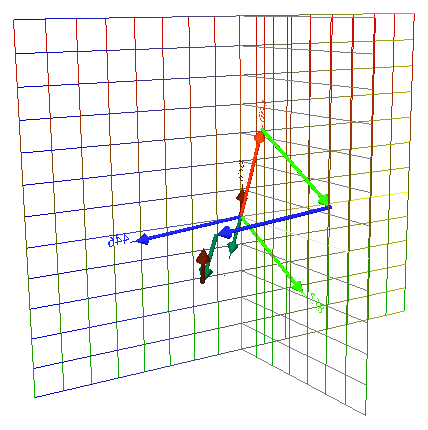 |
The
same 5 vectors point from the origin, again for the 5 unit-power
lights, at 603, 538, 446, 650, and 490 nm. Then the 5 vectors are
added, tail to head, as vectors normally add. The resultant is
a white vector. So, vector length has a non-mysterious meaning: According to the eye’s overlapping sensitivities, and a light’s wavelength and amplitude, each light maps to a vector with length and direction. Then vector addition predicts color matches. |
|
You
know already that a color mixture is predicted by adding vectors, but
vectors [X Y Z]T are
traditionally not graphed. Now suppose that it is 1950 and we are
trying to invent color television. It will be helpful if the phosphor
colors correspond to long vectors in well-separated directions.
Indeed, the NTSC phosphors are approximately at Thornton’s Prime
Colors, 603, 538, 446 nm. 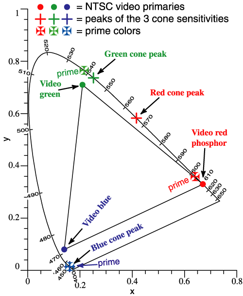 Nominal
time: 4:14 pm, Mountain Time
|
|
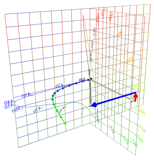
| Locus
of Unit Monochromats |
 |
If λ of a narrow-band
light of unit power is stepped through the spectrum and then its color
vector is plotted at each step, the vectors trace out a locus, shown at
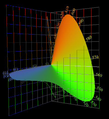
left. Jozef Cohen referred to this curve in 3 dimensions as "The Locus of Unit
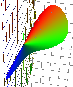
Monochromats." The curve is a spectrum locus. By monochromat, Cohen meant a narrow-band light. The word unit means unit-power. Each monochromat has the same optical power, which gives meaning to the vector lengths. The "unit power" idea was one of Cohen's great leaps forward, because in the legacy system, a vector [X Y Z]T is found, and then we rush to plot it in the (x, y) diagram, losing the vector length. "Unit power" leads to a picture in which vector length has meaning. |
| Locus
of Unit Monochromats (continued) |
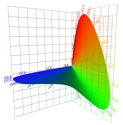 |
I often show the Locus of Unit Monochromats (LUM) by a surface. The locus is really the curve along the edge of the surface.
If you would look in Jozef Cohen’s articles, you would notice at first that his algebra looks different from mine. Also, he does not identify the LUM as a locus of tristimulus vectors. His vectors have more than 3 elements, and no preferred axes. Cohen showed that the LUM as he described it has an invariant shape. The LUM based on the orthonormal opponent functions is the same invariant locus discovered by Cohen. Algebraic tinkering could rotate the LUM with respect to the axes, but its shape would not change (except for a possible mirror-image transformation). |
| 5
Vectors Added (revisited) |
 |
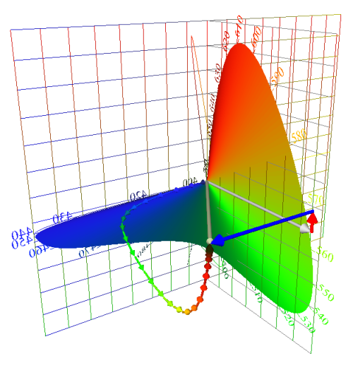
The locus of unit
monochromats can be included to give a frame of reference to a vector
sum or other interesting diagram. |
| Composition
of a White Light |
|
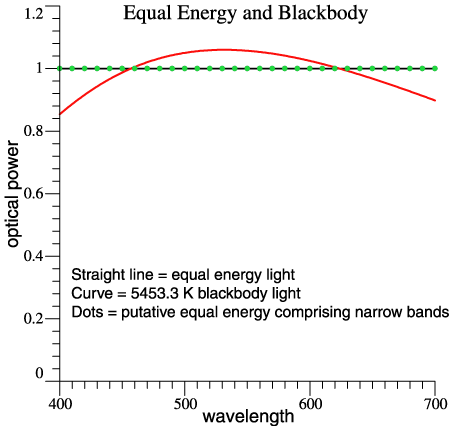
The so-called "equal energy light" is one that has constant power per unit wavelength across the spectrum, indicated by a solid black line in the figure at the right. The straight-line spectrum makes a simple discussion and is similar to a more realistic light, 5453 K blackbody (or 5500 if you like). For the next step, let’s assume an equal-energy light that packs all of its power at the 10-nm points, 400, 410, and so forth, as indicated by the green dots. |
 |
| Composition
of a White Light (continued) |
|
At right, the 31 narrow bands add up to make Equal Energy White. Each band contributes an arrow: blue, blue ..., blue-green, blue-green ... green ... green-yellow ... orange ... red. Added tail to head, the arrows sum to a particular white. The resultant of all that vector addition can be graphed as a single arrow from the origin. Conceptually, that arrow has 3 components, also shown as white, red, and blue arrows. The one arrow, or the set of 3, those symbolize the traditional approach, except it would be done in XYZ space. The chain of 31 arrows forms a pattern that will repeat for most white lights. It makes solid progress towards blue, then swings in the green direction, then back towards red. |
 |
| Composition
of a White Light (continued) |
 |
The swing toward red almost cancels the swing towards green. The greenish and reddish vectors are all present in the light, but red cancels green, approximately. I have explained the same idea in the past without vectors. |
| Now
let this white light be shined on colored objects, and think of what
an object color does. A red object reflects a range of the reddest
vectors, while absorbing green and blue. The light looks white, but
it must have red in it to reveal the red object as different from
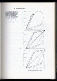
gray or green. The most saturated colors will be those that reflect one or two segments of the spectrum and absorb the rest. You can think of those colors as "snipping out" a segment of the chain of vectors that compose the white light. Is it a new idea to snip out part of the spectrum? No! The idea is called limit colors and is associated with MacAdam, Schrödinger and Brill, among others. On the next page is an illustration from MacAdam’s book, showing the possible ways to snip out parts of the spectrum. I won’t discuss limit colors at length, but they are a well-known idea. |
|
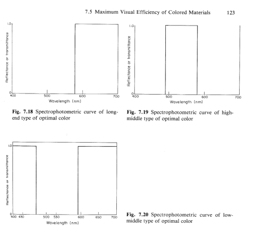
| Objects
that Snip out Parts of a White Light |
 Figures
from D.
L. MacAdam, Color
Measurement: Theme and Variations,
Springer, Berlin, 1981. Nominal time: 4:28 pm
|
 |
|
Observation: Many discussions of limit
colors focus on a color gamut. Here we look at a more basic step,
the limit color's interaction with the components of a white light. |
|
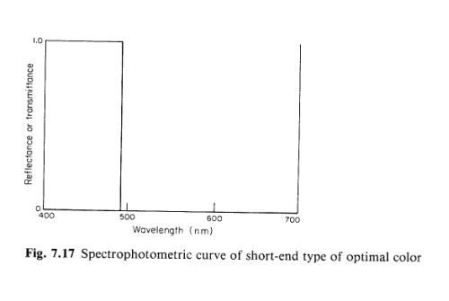
| One
Example: a Short-end Optimal Color |
At right, a
hypothetical "short-end" color reflects all wavelengths up to 540
nm. The rest of the light disappears. The light source is the
equal-energy light. Then the reflected light yields the vector chain
on the right. The entire equal-energy spectrum, as above, would sum
to the point where the one arrow, and the chain of three meet. When
the full chain of vectors for the equal-energy light is shown, you
can picture partial chains being snipped out according to MacAdam’s 4
types of optimal color:
|
 |
| Why
So Many 3-Dimensional Drawings? |
Let’s look at another use of the orthonormal opponent functions.
| Minimizing
Correlation |
|
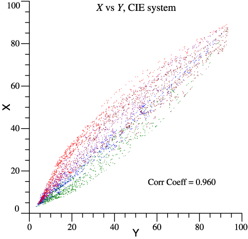
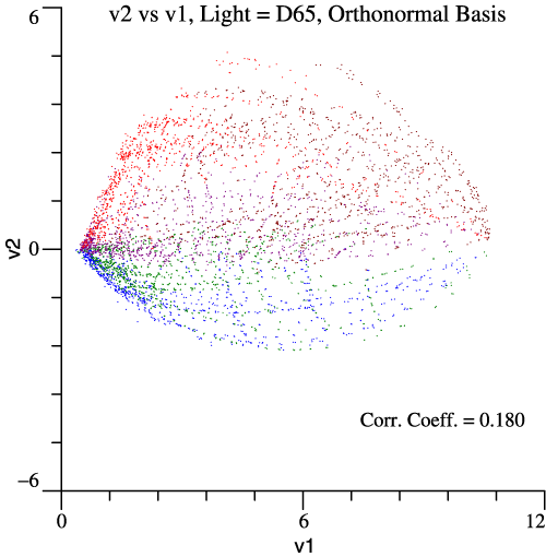
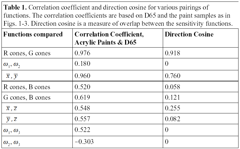
The orthonormal basis and Cohen’s space are a multi-purpose system. One benefit is that v1, v2, v3 are less correlated than other sets of tristimulus values.
|
 |
| Spectral
reflectances of 5572
samples
are available: Antonio
Garcia-Beltran, Juan L. Nieves, Javier Hernandez-Andres, Javier
Romero, "Linear Bases for Spectral
Reflectance Functions of Acrylic
Paints," Color
Res. Appl.23(1):39-45,
February 1998. Professor Garcia kindly sent me the raw data. To make realistic visual stimuli, let the paint chips be illuminated by D65. Then one stimulus can be plotted against another to see if they are correlated or independent. Garcia et al. put the chips in color groups, so I’ve colored the dots accordingly. The graph above shows that red and green cone stimuli are highly correlated, correlation coefficient = 0.976. X vs Y in the legacy system is a little better, while the opponent stimuli v1 and v2 are most independent, Correlation Coefficient = 0.180 . |
|
 |
 |
| Relationships
Among Equivalent Sets of CMFs |
| CMFs
Graphed as if they Were Lights |
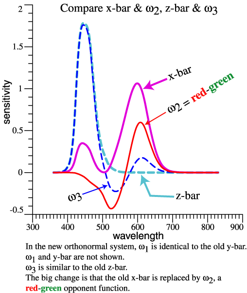
| Because of orthonormality, the functions |ωj〉 plot to the v1, v2, v3 axes. (Not emphasized in the drawing!) Legacy function y-bar also plots to the +v1 axis. Red and green cones plot near to each other and to +v1. Also, r cones and g cones lie in the v1–v2 plane. Blue cones and z-bar are the same direction and close to +v3. x-bar is not in the v1–v2 plane, or on the spectrum locus. In short, the graph shows similarities and differences among functions. | 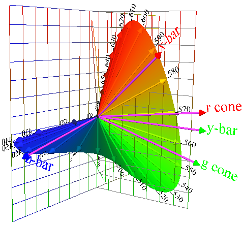 |
|
Simplicity would be lost if a similar plot were made with axes X, Y, Z. Then, for example the y-bar function would not plot to the Y axis, since y-bar has non-zero inner products with x-bar and z-bar. |
|
 |
|
| The orthonormal pairs, with cosine
= 0 give the lowest correlation of the paint chips, but not zero
correlation. With other populations of object colors, correlations may
vary. Nominal time: 4:42
|
|
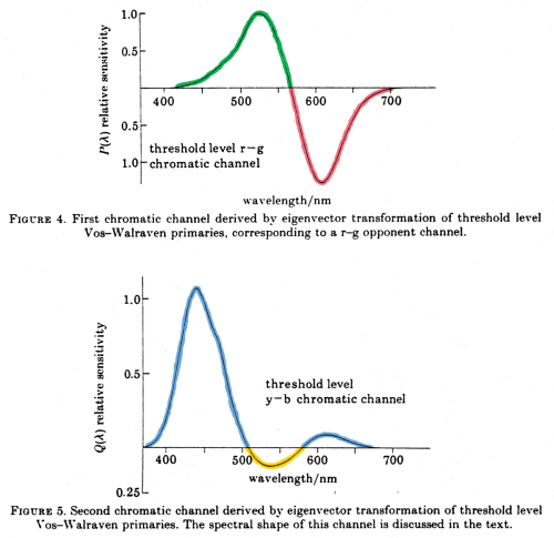
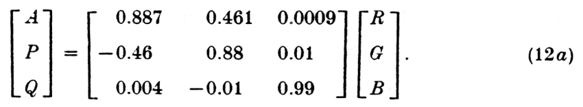
| Opponent
Colors and Information Transmission |
| Above I’ve shown the
benefit of an opponent system for information transmission (image
compression) in an empirical way, by starting with thousands of paint
chips. Buchsbaum and Gottschalk proceeded differently, deriving an
opponent-color system to optimize information transmission. They
started with cone functions that are similar to the ones I use, and got
a result like my opponent model. That is, they got an achromatic
function (not shown) similar to y-bar, and the red-green and
blue-yellow functions shown at right. The achromatic and red-green
functions have minimal blue input, and the blue-yellow function crosses
the abscissa twice and looks very much like function that I have been
using. |
 |
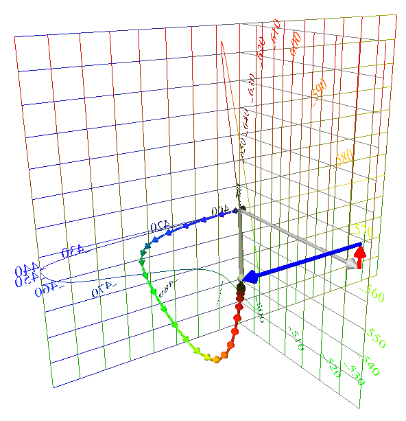
| This equation, scanned right out
of the original article shows how their first two functions have little
blue input, etc: |
|
 |
|
| Their functions A, P, Q are orthogonal, but not
normalized. Long story short, Buchsbaum and Gottschalk started with cone functions and derived opponent functions. They had a specific goal of optimum information transmission. I derived opponent functions in a simple way and discovered their connection to Cohen’s work. In the end, the sets of functions are extremely similar, confirming that the opponent basis is appropriate for image compression and propagation-of-errors. All orthonormal sets based on the same cones lead to the same Locus of Unit Monochromats, so in that sense Buchsbaum’s set cannot be wrong. [Gershon Buchsbaum and A. Gottschalk, “Trichromacy, opponent colours coding and optimum colour information transmission in the retina,” Proc. R. Soc. Lond. B 220, 89-113 (1983).] |
|
| Value
of Cohen's Space and Orthonormal Basis |
Benefits
of the orthonormal basis can be listed:
|
| The
last list
item is most important and
echoes Jozef Cohen’s ideas. If you have two lights (2 SPDs) as stimuli
to vision, they
have an intrinsic vector relationship. Each light has an
invariant fundamental metamer, which is its projection into the vector
space of the CMFs. Vectors V obtained using Ω have the same
amplitudes and vector relationships as fundamental metamers. Functions
x-bar and y-bar are intrinsically 40.5° apart, but ω1,
ω2, ω3
are 90° apart, so v1,
v2,
v3
are more appropriate axes than X, Y, Z. |
| End Digression,
return to Vector Composition of Lights |
| The figure at the
right once again shows the equal energy light as a vector sum. Power is
assumed to be in narrow bands at multiples of 10 nm, 400, 410, ... , 700
nm .
Although the power is the same in all bands, they map
to vectors of varying amplitude and direction, according to the facts
of color matching. As a practical matter, the little vectors are based
on the rows of matrix Ω. |
 Equal Energy light as a vector sum. |
 |
A key issue for lighting and color is that the chain of arrows swings toward green and back towards red. If this light shines on a white paper, the green and red almost cancel, but if it shines on a red pepper, the red pigment selects a group of red vectors, by absorbing green ones. Then it matters how much red was in the light. |
| Some
Lights Have Less Red
and Less Green |
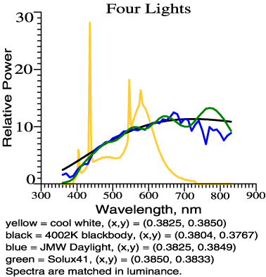
| A
white light has net redness or greenness that is small or zero. The
same white point can be reached by different lights in different
ways. SPDs of 2 lights are plotted at right. The black line is a for High Pressure Mercury Vapor light, while the blue is JMW Daylight, adjusted to have the same tristimulus vector. (Yes, that means they are matched for illuminance and chromaticity.) The wavelength domain is chopped according to the dashed vertical lines. The wavelength bands are 10 nm, except at the ends of the spectrum, with most bands centered at multiples of 10 nm. If one light then multiplies the columns of Ω, those products could be graphed as a distorted LUM, but we skip that step. |
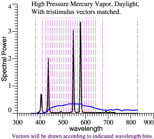 |
| Instead, the color composition of each light will be graphed as a chain of vectors. Nominal time = 4:52 pm | |
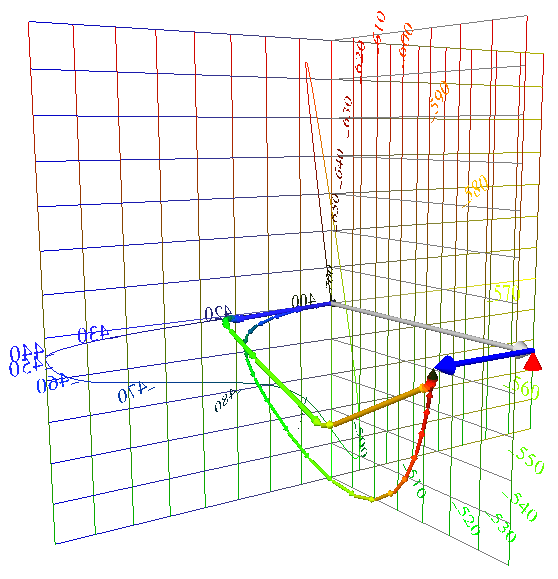
| Comparing
Color Composition of Lights |
| Now the same two lights are
compared in their vector composition. The smooth chain of thin arrows
shows the composition of daylight. Slightly thicker arrows show the
mercury light. The mercury light radiates most of its power in a few narrow bands, leading to a few long arrows that leap toward the final white point. Compared to “natural daylight,” the mercury light makes a smaller swing towards green, and a smaller swing back towards red. Such a light would leave the red pepper starved for red light with which to express its redness. |
 |
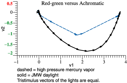
| Above two lights are
compared by the narrow-band components of their tristimulus vectors. At
right the same information is shown, but projected into the v1-v2 plane. The loss of
red-green contrast is the main issue with lights of “poor color
rendering,” and that shows up in this flat graph. If you were really
designing lights, you might use the v1-v2
projection as a main tool. You might want to add wavelength labels to
the vectors. (In the VRML picture, λ info is indicated by coloration.
In the picture at right, vectors that are approximately parallel
pertain to the same band.) |
 |
| Cohen’s space is not limited
to graphing chains of arrows. Suppose that the 64 Munsell chips from
Vrhel et al. are illuminated first by daylight and then by the mercury
light. Since the mercury light lacks red and green, we expect it to
create a general loss of red-green contrast among the 64 chips. The graph at right is a projection into the v2-v3 plane. Each arrow tail is the tristimulus vector of a paint chip under daylight. The arrowhead is the same chip under the mercury light. The lightest neutral paper is N9.5, and is a proxy for the lights. Notice that 3-vectors projected into a plane still have the properties of vectors in the 2D plane. As expected, red and green paint chips suffer a tremendous crash towards neutral. |
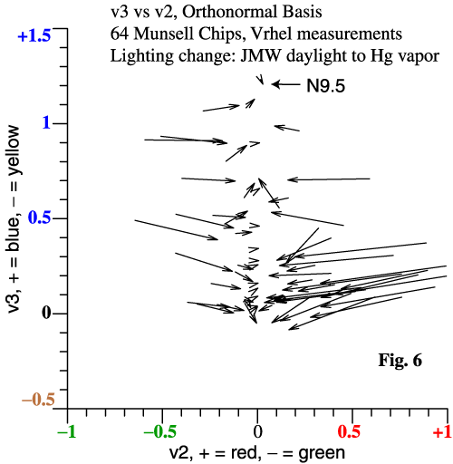 |
| Actual neutral papers appear as
arrows of zero length. For an alternate presentation about comparing lights, please see “How White Light Works,” and the related graphical material. |
|
| Camera's
Orthonormal Basis |
|
The Luther Criterion,
also known as the Maxwell-Ives Criterion:
For
color fidelity a camera’s spectral sensitivities must be
linear combinations of those for the eye. |
|
|
|
| Bold
Steps for Camera Analysis |
| Compare
Camera LUM to that of Human |
| At right is a screen grab from the
virtual reality comparison of a Dalsa 575 sensor’s LUM to the 2° human
observer LUM. The spheres represent the LUM of the camera The
arrowheads trace the best fit to the human LUM by the camera functions. Please let go of the details for a second, and try to see the big picture. The human LUM is an invariant representation of trichromatic color vision. The camera has its own LUM. We want to compare them, but must somehow position them for a clear comparison. The Fit First Method finds the camera LUM in a good alignment. |
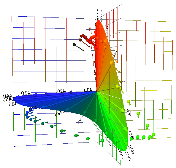 |
| The
Fit First Method |
| Conceptually, the camera’s LUM
(spheres) is more fundamental than the fit to the human LUM
(arrowheads). The trick of the Fit First Method is to find the best fit
first, then find the LUM from that. Here is the computer code: Rcam
= RCohen(rgbSens) # 1
CamTemp = Rcam*OrthoBasis # 2 GramSchmidt(CamTemp, CamOmega) # 3 The camera’s 3 λ sensitivities are stored as the columns of array rgbSens . Because of the invariance of projection matrix R, it doesn’t matter how the functions are normalized, or whether they are actually in sequence r, g, b. Statement 1 finds Rcam, the projection matrix R for the camera. RCohen() is a small function, but conceptually, RCohen(A) =
A*inv(A’*A)*A’ . (7)
In other words, step 1 applies Cohen’s formula for the projection matrix. Then Rcam is the projection matrix for the camera. In step 2, the columns of OrthoBasis are the human orthonormal basis, Ω . The matrix product Rcam*OrthoBasis finds the projection of the human basis into the vector space of the camera. But, the wording about projection is another way of saying that step 2 finds the best fit to each ωi by a linear combination of the camera functions. So, step 2 is the “fit” step. |
|
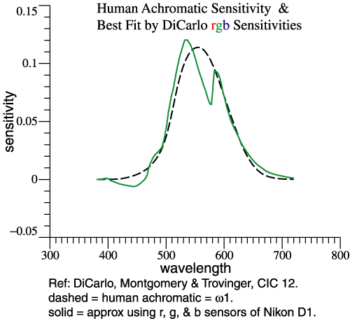
| Step 2 does 3 fits at once, but to
clarify, consider just one of them. At right, the dashed curve is ω1,
the human achromatic function. The camera in question happens to be a
Nikon D1. The solid curve is a linear combination of that camera’s r,
g, and b functions that is the least-squares best fit to ω1.
There would be other ways to solve the curve-fitting problem, but
projection matrix R is convenient. A best fit is found for each ωj
separately. The resulting re-mixed camera functions are not an orthonormal set. |
 |
| Step 3,
Orthonormalize the Re-mixed Camera Functions |
|
| Since
the re-mixed camera functions are computed separately, they are not
orthonormal and would not combine to map out a true Locus of Unit
Monochromats. But they mimic Ω and are in
the right sequence. We need
to make them orthonormal, which is what the Gram-Schmidt method does,
Step 3. |
|
 |
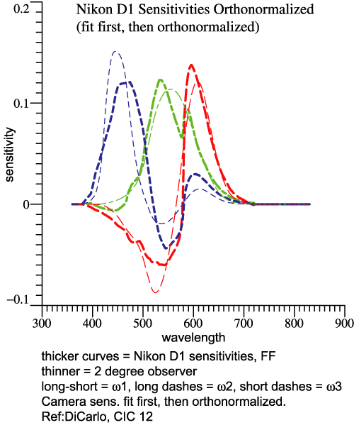 |
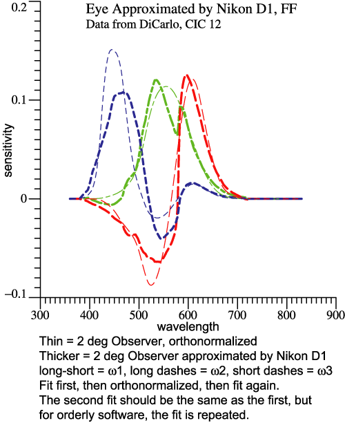
| You
are forgiven if you feel that the graphs above look alike. But the
one on the left shows the set of “fit” functions. The one on the
right shows the orthonormal basis of the Nikon D1. The thinner curves
pertain to the 2°
observer, the thicker ones to the camera. Why Does it
Matter?
When
you have the orthonormal basis, for the eye or for a camera, you
can do many things with it.
Combining the 3 functions generates the Locus of Unit Monochromats.
The orthonormal property leads to some simple derivations. On the Q&A
page, see "Can
we have fun with orthonormal functions?"The Noise Issue
To extract color
information, some subtraction must be done. The signals subtract but
the noise adds (in quadrature). The noise discussion becomes more
concrete when one can say exactly what subtraction will be done. The
camera’s orthonormal basis is a natural to be the canonical transformed
sensitivity. Orthogonality means “no redundancy” and normalization
standardizes the amplitude. There’s a numerical noise example worked
out in the CIC 14 article. For now, the point is that expressing camera
sensitivities as an orthonormal basis is a giant step towards dealing
with noise.
|
|
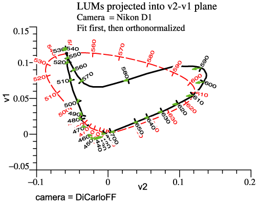
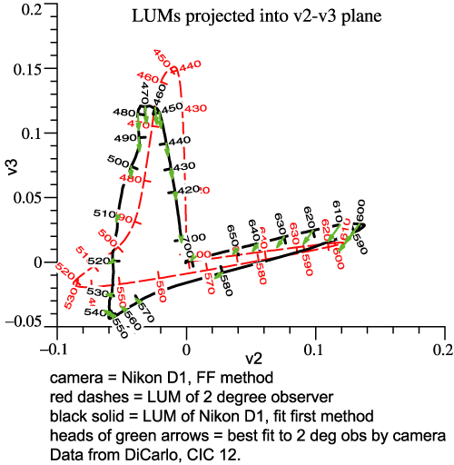
| Camera
Example, Nikon D1 |
| The last 4 graphs above pertained
to the Nikon D1, based on data from CIC 12. At right are the camera’s
red,
green, and blue sensitivities. The camera’s LUM can be compared to the eye’s. Rather than another perspective picture, we now view the LUMs in orthographic projection (2 graphs below). The dashed curves are the human locus. The solid curves are the camera’s locus, while the tips of the small green arrows are points on the best-fit sensitivity function. |
 |
 |
 |
| Now
you may say “These curves mean nothing to me!” That may be at
first, but the graphs contain a complete description of the camera
sensor, with no hidden assumptions, and no information discarded. Finding
Some Meaning in the Camera's LUM
Consider the left-hand graph, “LUMs projected into
v2-v1 plane.” Only the red and green receptors contribute to the human
LUM in this view, and v1 is the achromatic dimension for human, based
on good old y-bar. In this plane at least, the particular camera tends
to confuse wavelengths in the interval 510 to 560 nm, which are nicely
spread out as stimuli for human. Yellows, say 560 to 580 nm, have lower
whiteness than they would for human. The camera has other differences
from human that may be harder to verbalize. To the extent that finished
photos look wrong, one could revisit these graphs for insight.More
Examples
Five detailed examples were prepared in 2006, and they
are linked from the further examples page. For
instance, Quan’s optimal sensor set indeed looks good in any of
the graphical comparisons to 2°
observer. (See http://www.cis.rit.edu/mcsl/research/PDFs/Quan.pdf
.) |
|
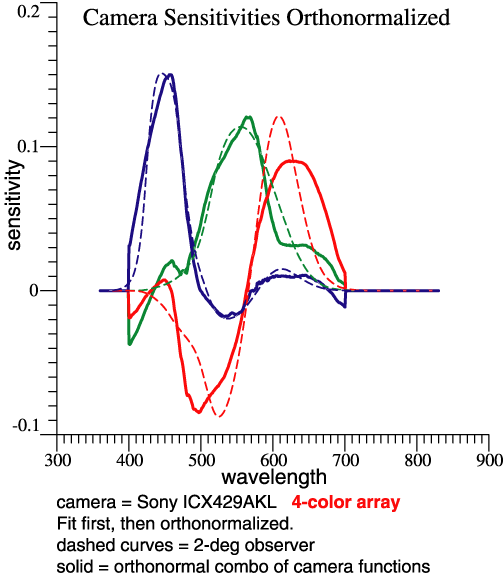
| Something
Completely Different: a 4-band Array Nominal time: 5:22 pm
|
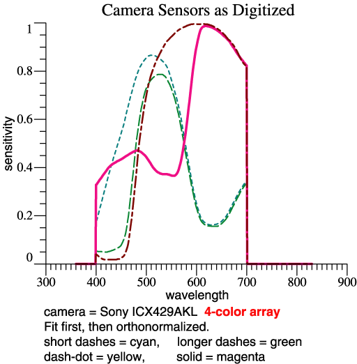
| Sony publishes a specification for
a 4-band sensor array, the ICX429AKL. I’m not sure of the intended
application, but it could potentially be applied in a normal
trichromatic camera. The Fit First Method readily fits the 4 sensors to
the 3-function orthonormal basis. |
|
| The four sensitivities are seen
at right. The key steps look the same: Rcam =
RCohen(rgbSens)
. Recall that the
projection matrix Rcam is a
big square matrix of dimension NxN, where N is the number of
wavelengths, which might be 471. The 4th sensor adds a column to the
array rgbSens,
but does not change the dimensions of the result Rcam. After
the key "fit first" steps, I did have to re-think some auxiliary
calculations because of the 4-column sensor matrix.CamTemp = Rcam*OrthoBasis GramSchmidt(CamTemp, CamOmega) |
 |
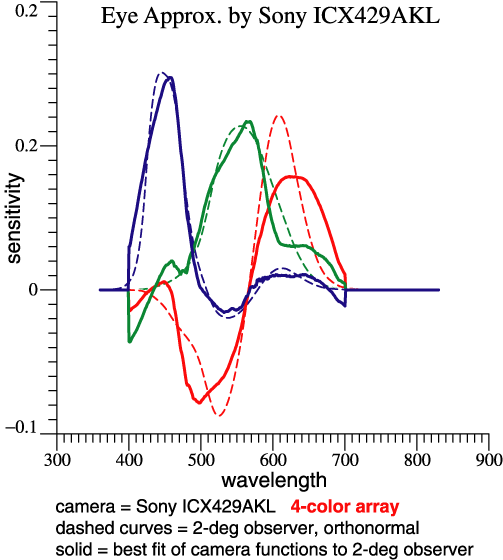
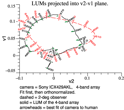
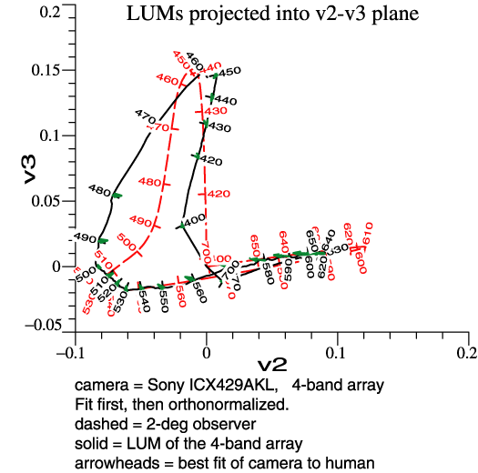
| The camera's orthonormal basis
Rcam comprises 3 vectors that are linear combinations of the 4 vectors
in rgbSens. I wanted to find the 4x3 transformation matrix relating the
one to the other, in order to stimulate thinking about noise. The
program output itself explains the method as follows: Similar to Eqs. 15-18
in CIC 14 paper,
Transform from sensors to CamOmega: We want to solve CamOmega = rgbSens * Y , where Y is coeffs for 3 lin. combs. MPP = inv(rgbSens'*rgbSens) * rgbSens' Y = MPP*CamOmega = 0.24845 0.13737 0.35971 -0.34663 -0.43708 -0.45585 -0.22433 -0.088434 -0.033503 0.26839 0.22522 0.055984 Column amplitudes = vector lgth of each column = 0.55158 0.51812 0.58433 The columns of rgbSens actually contain the 4 sensitivities, cyan, green, yellow, magenta. MPP is the Moore-Penrose Pseudoinverse. If you search that phrase in Wikipedia, you’ll find an article from which the formula above was taken. Jozef Cohen did not derive his projection matrix from the pseudoinverse, but the ideas are closely related. (See the Q&A page.) Keeping in mind that the sensitivities are all >= 0, matrix Y gives some idea how much subtraction is done to produce the sensor chip’s orthonormal basis. That’s a step toward thinking about noise. Below are the 3 orthonormal functions, and also the 3 best-fit functions made from the 4 camera sensitivities. The only source of “noise” is the errors that I introduced while converting graphs to numbers. It becomes more visible here, after subtractions. |
|
 |
 |
|
Some noise also shows up in the projections of the LUM, below. It would appear that color fidelity is not good; reds and oranges may lose some redness. |
|
 |
 |
| Lighting
for a Copy Machine?? Nominal time: 5:30 pm, Mountain Time
|
| I
have promised that we would combine the camera analysis and the
lighting analysis, to analyze something like a copy machine, where the
sensors and the lighting are under engineering control. I have written
the computer program, and we can absolutely
do that, but it gets confusing because there are 2 independent
variables, the light and the sensors. Let’s look at the step-by-step
design of a lighting system for humans. That works out well, and in
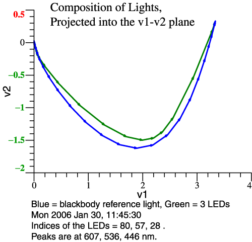
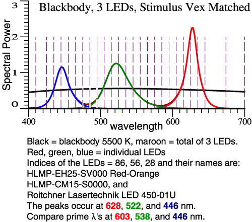
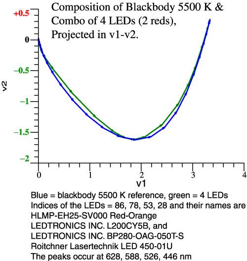
fact it’s already on my web site: . That exact URL will put you in the middle of a long web page, at the point where a discussion of color rendering begins. After we review the lighting design, there will be one or two examples of camera+lighting analyzed together. Problem Statement: For the 2° Observer, Thornton’s Prime Colors are 603, 538, 446 nm. [See CIC 6, and Michael H. Brill and James A. Worthey, "Color Matching Functions When One Primary Wavelength is Changed," Color Research and Application, 32(1):22-24 (2007). ] If you would make a light with 3 narrow bands at those wavelengths, the light would tend to enhance red-green contrasts, making some colors more vivid, though it would do a bad job with saturated red objects. You might think then that a white light could be made from 3 LEDs whose SPDs peak at those wavelengths. This idea falls short because LEDs are not narrow-band lights. Our task then is to see what happens when real LEDs are combined, and design a good combination by speedy trial-and-error. We'll see two graphs per example: the LED spectra and their sum, and then the vectorial composition of the LED light in comparison to 5500 K blackbody. Clicking either image gives more detailed information. LED Lighting Example 1: The reference white is 5500 K blackbody. The 3 LEDs are chosen by their peak λ's , which are set close to the prime colors. We see at right that the blackbody (blue line) makes a bigger swing to green and back. This LED combo will dull most reds and greens. |
|
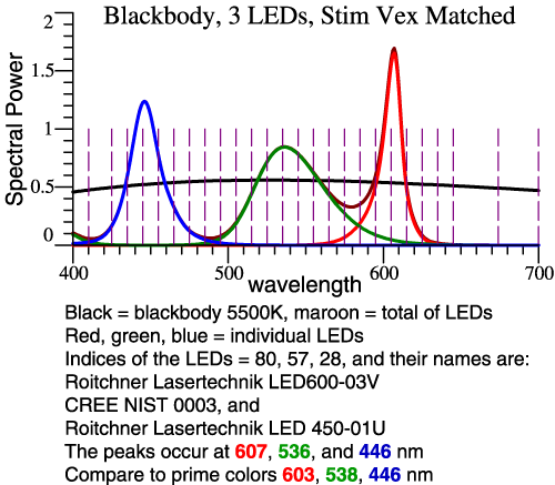 |
 |
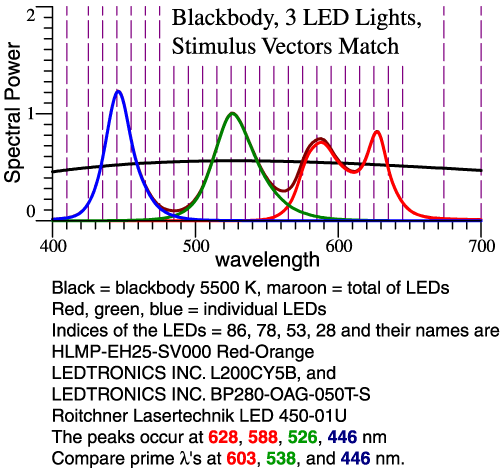
| LED Lighting Example 2: To increase the swing towards green and back, we let the green be greener (shorter λ) and the red be redder (longer λ). In all cases, the LED amplitudes are adjusted so the total tristimulus vector matches the blackbody. | |
 |
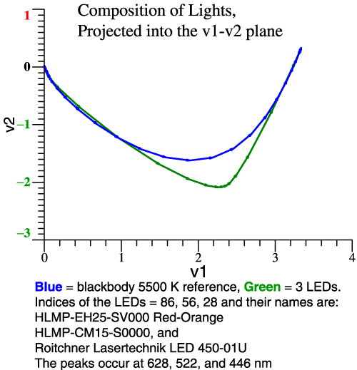 |
| Still on example 2, we can see
from the vector composition (right-hand graph) that red-green contrast
will be good, but some colors may be particularly distorted. Clicking the
left-hand graph confirms that idea in the color shifts of the 64
Munsell papers. LED Lighting Example 3: The problem in example 2 is known to some lighting experts. The light needs to have a broader range of reds. The remedy is to use 2 red LEDs. For simplicity, the proportion of the 2 reds is fixed, not adjustable. |
|
 |
 |
| Think
of those green and red limit colors. Some of those colors will still be
dulled, but
we are tracking the blackbody pretty close. A bit more tweaking is
possible. |
|
| So,
We Know How to Design a Light. Now Let the Camera Also be a Variable. |
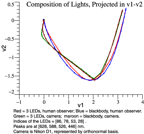
| Let the
lights be the last pair demonstrated above. The reference white is 5500
K blackbody. The 2 red LEDs are in fixed proportion, but the R, G, and
B LEDs are adjusted to match the blackbody. The adjustment of R, G, B
is done for human, and then separately for the camera. Using the Fit
First method, it is possible to graph the human and camera
sensitivities together, and then the compositions of the lights as seen
by human and by camera. Analysis of a
(Very Hypothetical) Color Copier
|
|
| The same LEDs are
used as in the final light design above, p. 53. The camera is the Nikon
D1, whose sensitivities are given on page 43. The data were swiped from
DiCarlo’s paper at CIC 12. (Page numbers refer to the tutorial handout.) |
 |
| A
Different Hypothetical Copier |
|
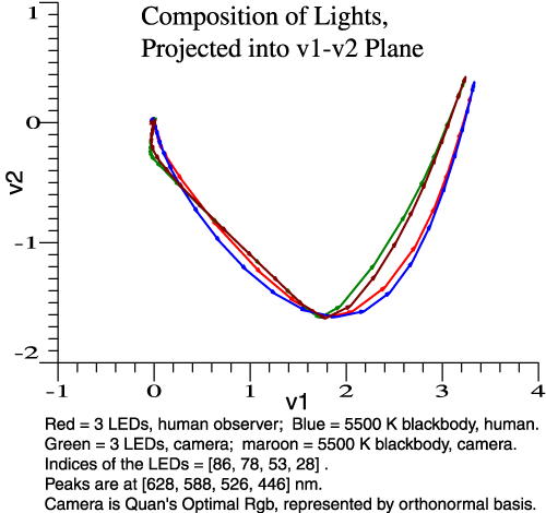
| Now the light is
the same, but the camera is the “optimal” sensor, taken from Quan’s
dissertation. The camera’s total “reach” into the green and back towards red is like the eye’s. But, many reds and greens will be dulled. You can see it by thinking of them as pass-band colors. The camera falls short because parts of the chain of vectors are too straight. To this camera, successive bands point in the same direction in color space, at least in this projection. We can see the same thing by looking at the Quan sensor’s Locus of Unit Monochromats, next graph. To the extent that a camera fails to discriminate certain wavelengths, the light can't fix the problem. |
 |
|
At right, the LUM of the Quan Sensor is compared to that of human. This sensor is better than many; It tracks the human LUM in a general way. We can see shortcomings in two areas. Picture the “unit monochromats,” the vectors that define the curves. The human vectors have steadily changing direction but long amplitude, from about 540 nm to 605 nm. Then the human LUM goes smoothly round the bend, but there is still some change of direction at 610, 620, 630 nm.
|
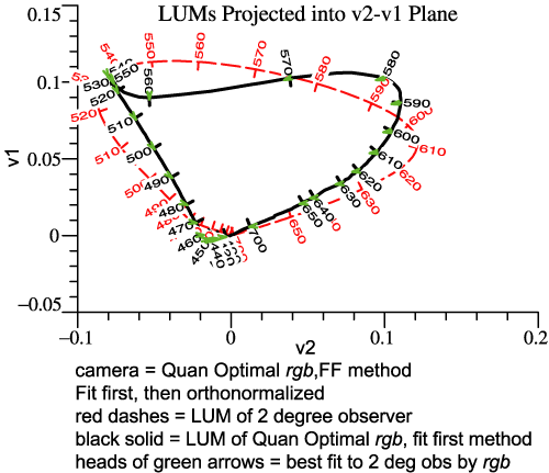 |
| By
contrast, the Quan sensor goes round the bend too soon, at 585. In a
second quirk, the Quan sensor tends to lump together 520, 530, 540,
550, wavelengths that would be well discriminated by human. These
features of the Quan LUM translate into the too-straight regions when
lights are composed on p. 56. The lumping-together of wavelengths around 540 is something that many cameras do, and it happens because the red sensitivity is negligible there. The Quan sensor does discriminate those wavelengths along the v3 or blue-yellow dimension. There is no way to fix the lumping-together by changing the light. At the long-wavelength end, it might be possible to get some marginal improvement by boosting the light at long wavelengths, since the issue is a kind of absolute sensitivity dropoff. |
|
| Vectorial
Color |
| The
End |
|
Thank you very much for signing up and for your attention.
Please feel free to contact me at any time. I am always eager to discuss lighting, color, cameras etc.
Jim Worthey
|
| Special
Credit |
|
William A. Thornton Michael H.
Brill (But
MacAdam gets a demerit for disparaging Cohen's work.) Calculations were
done with O-matrix software. |
William A. Thornton
1923-2006 |
 Jozef B. Cohen
1921-1995 |
Bonus Picture: Jim Worthey, Jozef
Cohen, Nick Worthey, circa 1993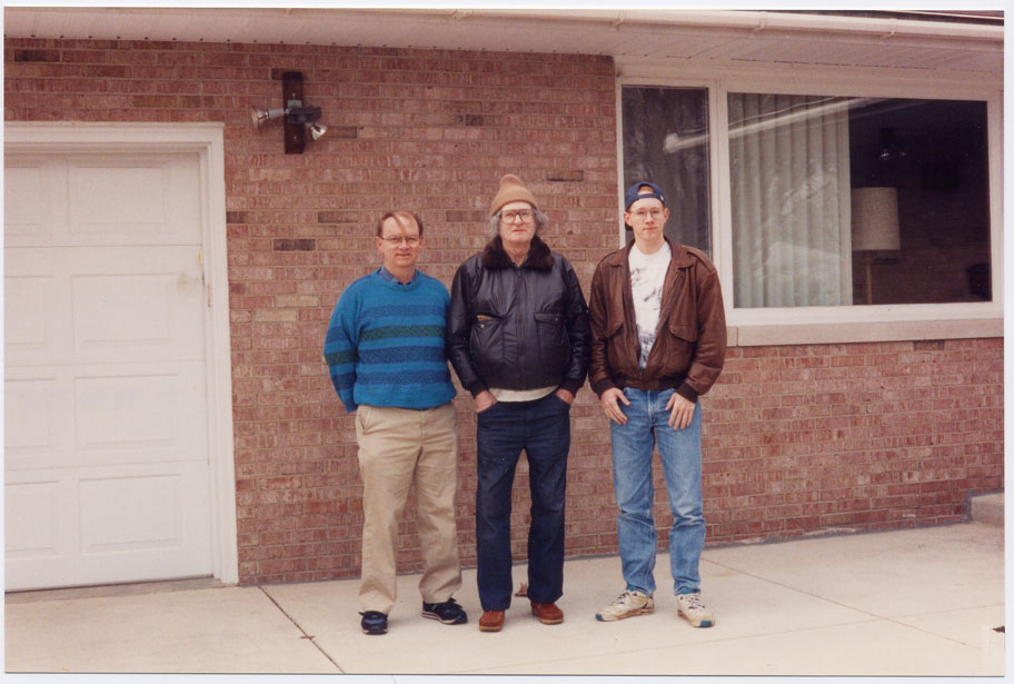 |
||
| Bonus
Example: Multi-primary System (N > 3) |
| This example is
based on real hardware. A laser radiates in 8 narrow bands at once, 647, 568, 530,
520, 514, 488, 476, and
457 nm.
Using an acousto-optic modulator, it is possible to modulate the 8
bands separately. I was asked a question about how to program the
gadget, but a more basic question is, "What do you really have
colorimetrically?" A red, a green, and a blue would give a good range
of video colors and then what can the other laser lines contribute? Each of the lines has an intrinsic power limit, and then according to the wavelength and the eye's LUM, a color vector results. For instance, we know that long-wavelength red makes a nice ruby color, but the eye's sensitivity is declining at the longest wavelengths. Those facts are expressed in the vector diagram, not lost. |
 |
| In
the diagram above, the wavelengths with their power limitations give
vectors from the origin. Then those vectors are scaled down by a
convenient ratio and added to give the total vector of the unmodulated
laser. The
647 nm is a nice ruby red. The 514 nm line can be a good saturated
green primary, then there is a question whether the 530 nm line adds
much. A final design would depend on goals, including needed power
level. The
point for now is that the vector diagram combines colorimetry with the
physical data in a logical way. |
|
| Stop |
| Scroll
No Farther |
 |
Material Below Addresses Obscure Questions |
|
||||||
|
|
|
|
|